This year has been like no other in living memory. Coronavirus has shaken our collective sense of what normality means and will undoubtedly continue to affect the world for years to come in one way or another.
In this blog post I to try to gain some insights about the impact of Coronavirus around the world using publically available datasets.
The data was obtained from Our World In Data, a scientific online publication whose research team is based at the University of Oxford and focuses on large global problems.
Objectives and questions to be answered
- Which countries were most affected by Covid-19?
- What percentage of worldwide cases is accounted for by the top 10 countries?
- Which countries were most affected accounting for differing population sizes?
- Which countries did the most testing for Covid 19?
- How did the rise of Covid look?
- How did lockdowns, in particular the UK lockdown, affect the rise in new deaths?
- Which countries suffered the most economic impact?
- A closer look at Brazil: how did the lack of lockdown fare for Brasil?
- A close look at Scandinavia and Sweden: how did the Swedish policy fare in comparison to its neighbours?
The full code and technical analysis can be found in this notebook.
What countries are most affected by COVID-19?
To kick-off this analysis, let’s look at which countries around the world seem to have suffered the most with COVID-19.
By total cases
The first metric I will use to answer that question is the total case number per country.
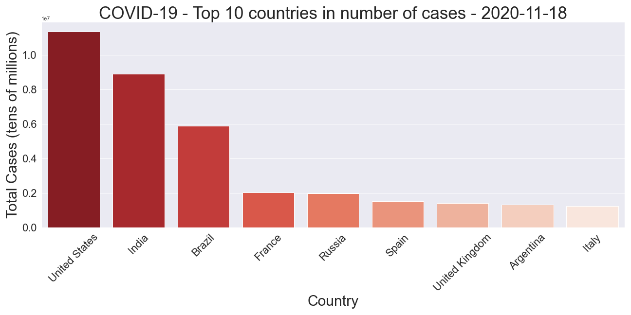
The US has the highest number of cases in the world with over 11 million on the 17th Nov 2020, followed by India with almost 9M, and then Brazil with almost 6M.
It can also be computed that there are 55,154,651 worldwide cases.
Total cases per million
The previous plot was interesting, but if a country has a much greater population than another country then all things being equal we would still expect to have higher case numbers in that country. For example, one might argue that even if the US had locked down super early and implemented the strictest measures possible then they’re bound to have more cases than a tiny country like Aruba, merely because of the difference in population.
For that reason, let’s look at the total cases per million of the population.
Given that some countries (such as Aruba) have utterly tiny populations, per capita case numbers may not be so meaningful for them, so we filter out any countries with a population smaller than 10M.
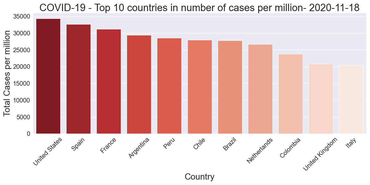
It can be observed that the US still leads the way in terms of cases recorded, even when accounting for its large population.
By deaths per million
Similarly, let’s try to measure the impact of Covid-19 on a country by considering the death rate per million. This is important as the number of cases is not the whole story. For example if a country does much more testing than another country then we may expect them to have recorded more cases too.
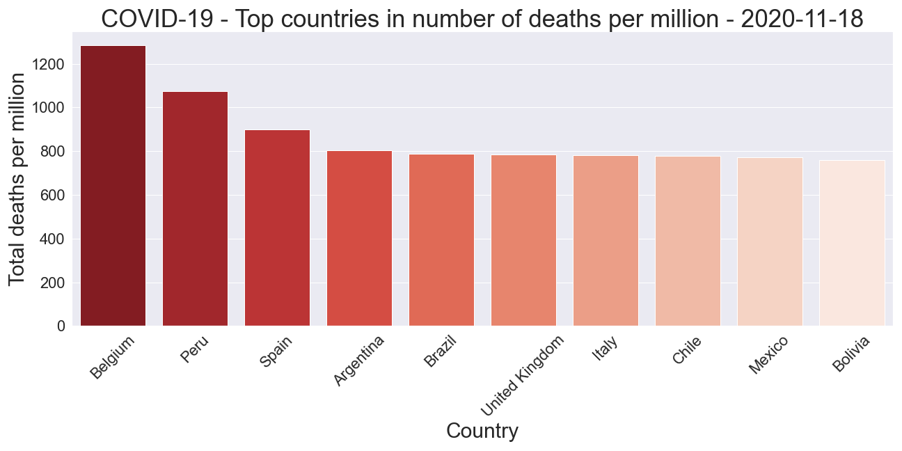
This graph is interesting and we see that in terms of deaths per million the US is no longer in the top 10. Belgium is the worst affected, followed by Peru.
Peru is interesting as it implemented one of the strictest and earliest lockdowns in Latin America. It’s somewhat surprising that it would have one of the highest deaths per million.
One other thing we can look at is the proportion of the worldwide deaths that came from the top ten countries by death count: We have 1,328,537.0 worldwide deaths from COVID on 2020-11-17 and 67.63% came from the 10 countries.
Testing per thousand
Case numbers are bound to increase the more tests that are done by a country. Let’s check out countries by how many tests per thousand of the population have been carried out.
Was President Trump correct to assert that the US leads the world in terms of Covid testing done?
Again I will filter out countries with populations less than 10M. Moreover, each country may have recorded the latest data for this statistic on slightly different days, so the analysis takes the most recent date.
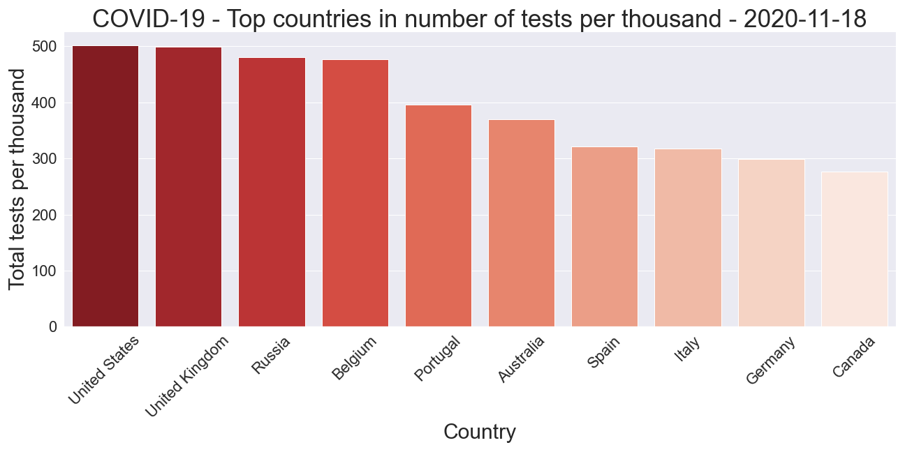
We see that the US is leading the way in tests performed per 1000 people, so it shouldn’t be that surprising that their case numbers are higher too. This may partly explain why the US has the highest per million case count but doesn’t appear in the top 10 in terms of per million death rate.
Trump had tweeted on the 12th of May that the US had carried out more tests than every other country in the world combined.
The analysis showed that this was indeed true. The US had done over 10M tests on this date. The country with the next most tests was Russia with nearly 6M. However the rest of the world combined had still done more tests than the US, with over 35M tests at this date.
The increase in Covid
Evolution in terms of case numbers
We can get an idea of the speed covid spread per country by plotting the time series of the case count. To keep the charts uncluttered I will do this for just the 5 countries with the most cases.
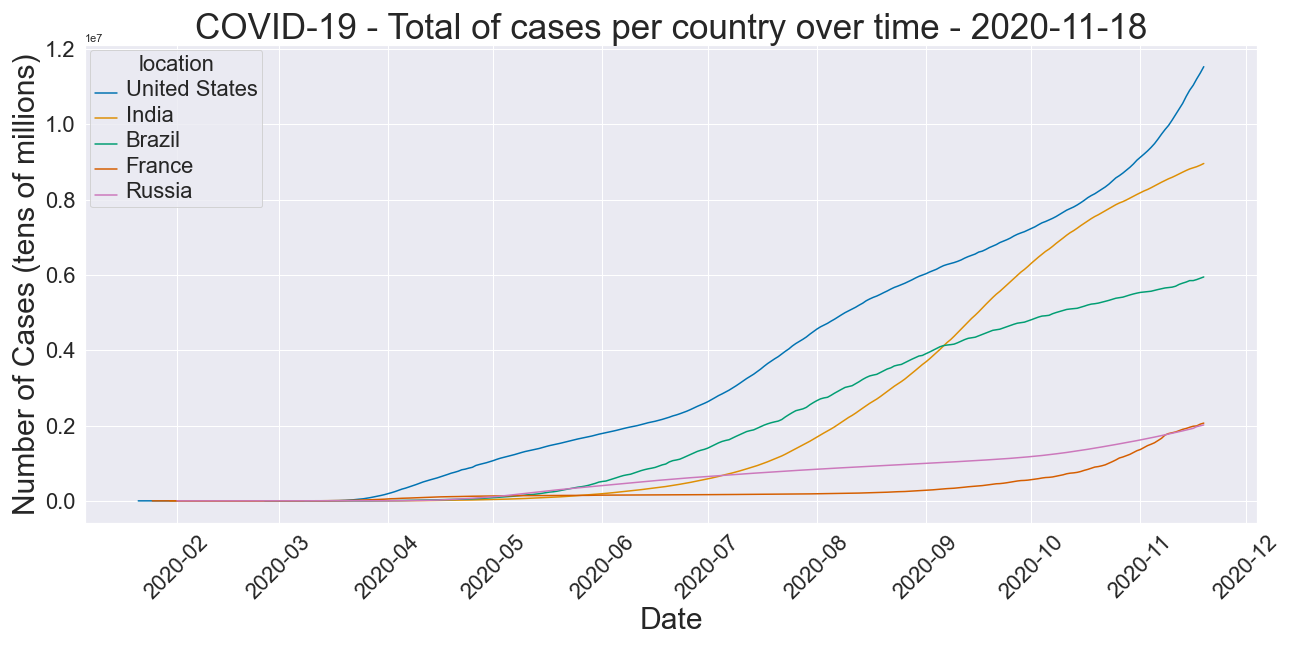
The number of cases starting increasing around mid to late March for the US, with upticks around July and again in October, showing no sign of levelling off.
For a long time, Brazil, was the country with the second-highest number of cases until it was overtaken by India in early September.
France seemed to flatten out for a while but has recently seen the case numbers begin to rise again.
Evolution in terms of death counts per million
We take the top countries by per million death counts and plot the evolution of total deaths in the country over time
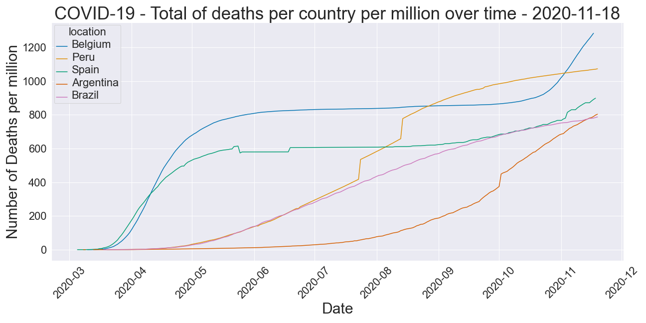
This graph shows Belgium having the highest death counts per million, and despite flattening their curve in May, they entered a second wave around October.
Peru is the next most affected and has seen a fairly steady increase in deaths per million. There are some odd sharp jumps in death counts, most likely to do with the way the data was collected (entering big batches of deaths to the system after delay all at once).
Spain has also been very badly affected and just like Belgium has entered into a second wave as the European winter begins.
Argentina seems to be a late bloomer. Despite their initial hard and strict lockdown, it seems since around August the death rate per million has exploded there.
A closer look at Brazil
Brazil has been something of an exception to most countries in the world. President Bolsonaro is not a fan of lockdowns and the policy in Brazil was much more relaxed than most countries around the globe. Borders reopened around July and tourism has been allowed since that time.
Brazil recorded its first case on 2020-02-26 and its first death was on 2020-03-18
Let’s check the lag between cases reported and total deaths for Brazil
Since the case numbers are much more than the deaths, the second plot here uses a log scale on the y-axis to better highlight the relation in time between case numbers and deaths.

We see that there is a lag between total cases and total deaths that appears to be around 2 weeks, at least for the first few months of the pandemic.
Economic impact
The data to measure the economic impact was obtained from OECD.Stat OECD’s quarterly national accounts data, available at OECD.stat
I will compute the percentage change in GDP compared with the same quarter of the previous year (Q2 2019) to try to get an idea of which countries suffered the most economic impact from Covid-19.
I chose to look at GDP measured by the “output approach” to calculate GDP. It sums the gross value added of various sectors, plus taxes and less subsidies on products.
The measure “CQRSA” represents millions of national currency, current prices, quarterly levels, seasonally adjusted.
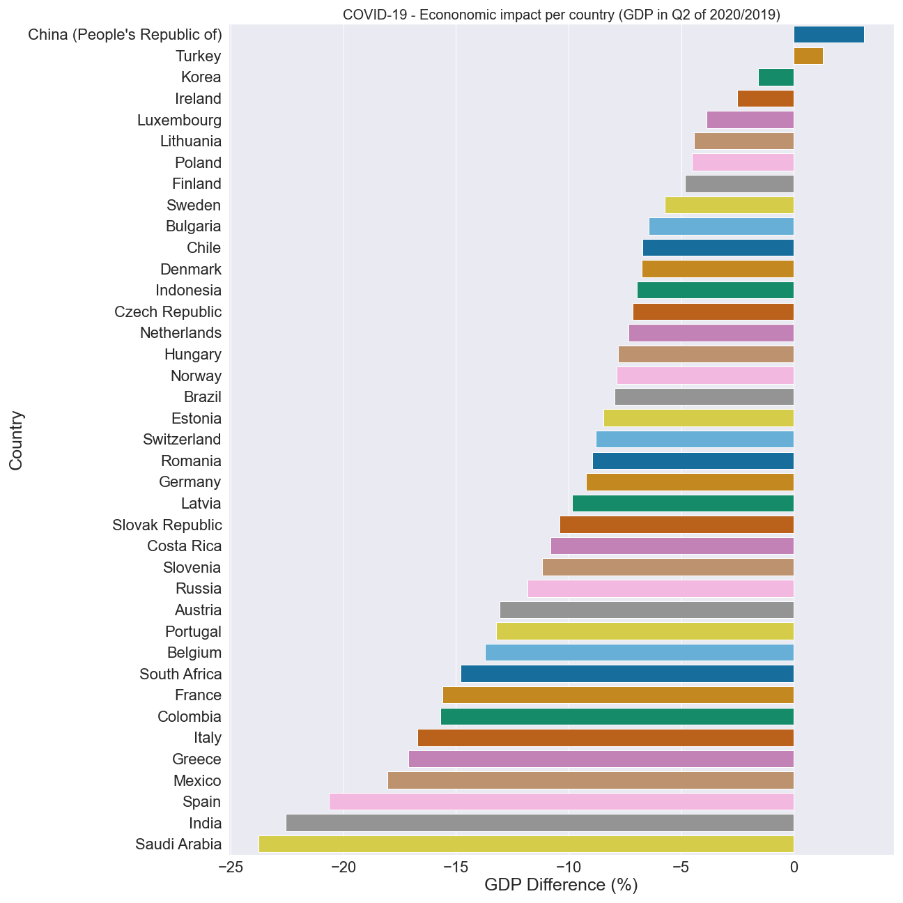
It seems from this measure at least that China and Turkey experienced growth. Ireland and Scandinavian countries suffered less severe impact than other European countries, whereas Spain, Italy and France were very strongly affected. Saudi Arabia also appears to have took a huge economic blow in this quarter. We could speculate that this might be to do with global oil demand falling during global lockdowns. However, we may want to consider other measures of economic impact to be sure.
Sweden: a closer look
Sweden also drew fire for its approach to handling Covid-19. The country had a much less stringent lockdown than its neighbours and other European countries generally.
Let’s see what the data can tell us so far about how Covid is affecting Sweden vs the rest of Scandinavia.
Economy
Looking at the economic impact (as defined by the same measure previously) in Scandinavian countries in particular:
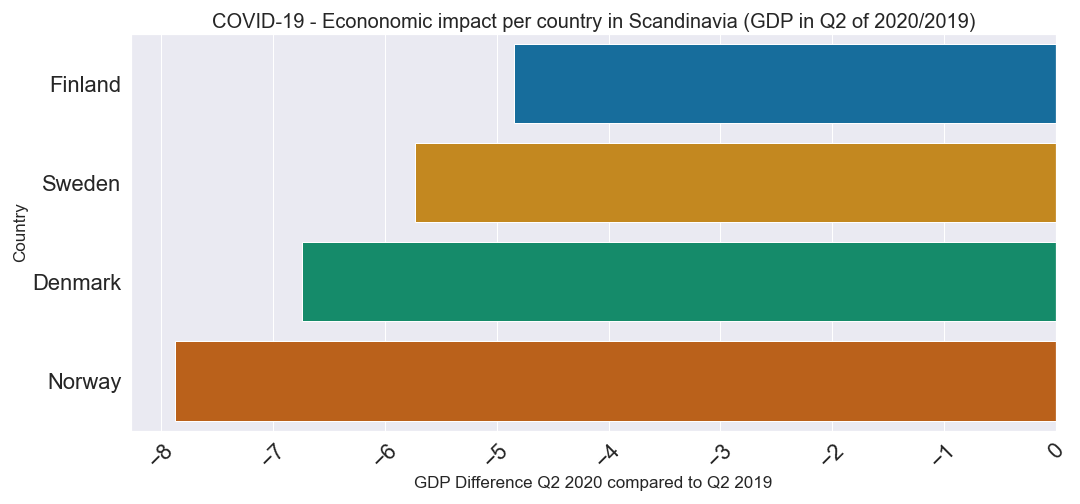
We see that Sweden is faring quite well, but it’s still suffered more economic impact than Finland.
Total cases per million
Here we compare the evolution of the number of cases per million between Scandinavian countries
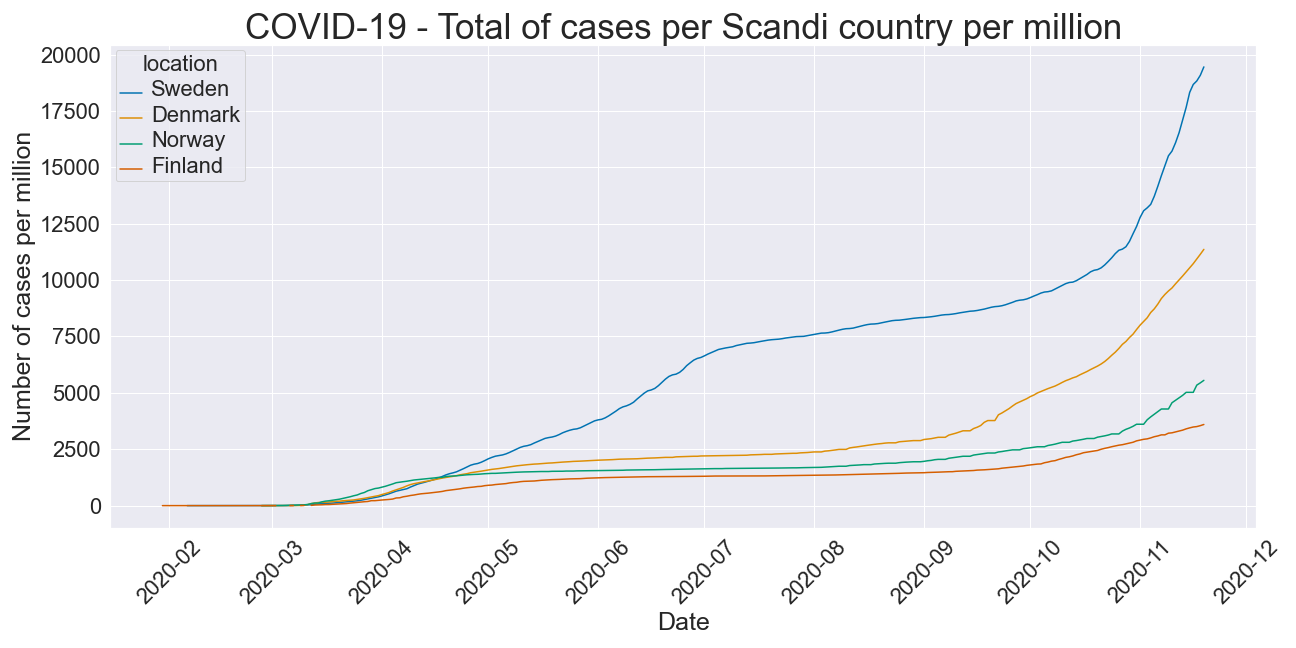
It seems that Sweden is faring the worst out of its neighbours, even when accounting for population differences. Its neighbours seemed to flatten more after the 1st wave, however now all of these countries seem to be in the midst of raising cases in the second wave.
Deaths per million
If we also look at the death count per million
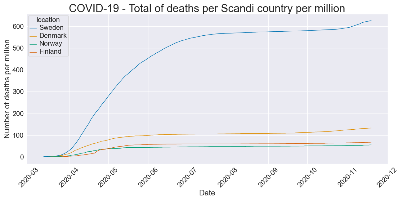
Sweden also seems to be doing worse on this metric than its neighbours.
UK lockdowns
The UK went into its first national lockdown on 23 March 2020, and the second lockdown began on the 5 Nov 2020.
In this section I will take a look at what impact if any these lockdowns had on the rising daily case numbers.
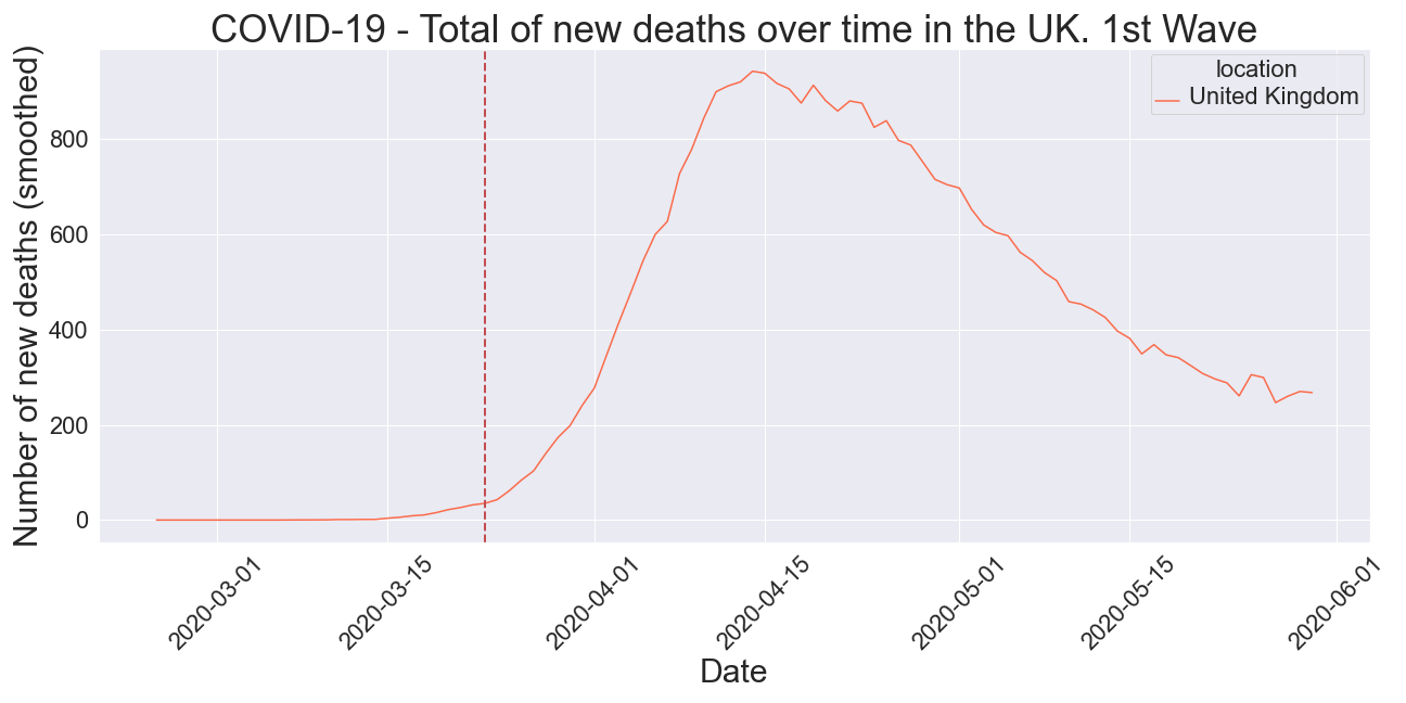
It seems that in March, after the first lockdown, it took around 3 weeks to see a cessation in the raise of daily new deaths.
As for the 2nd lockdown:
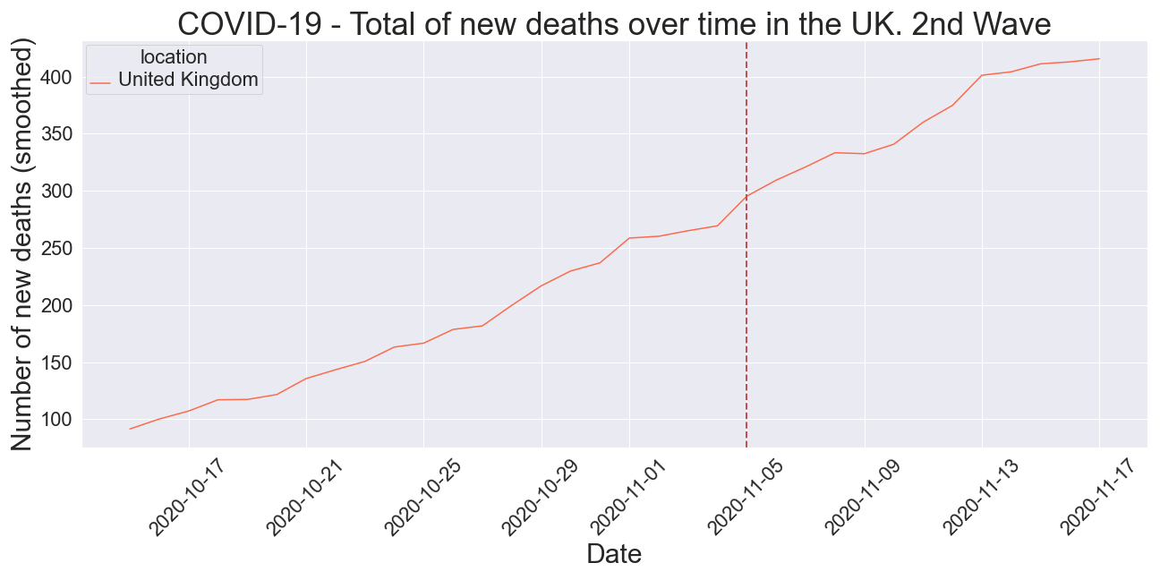
we seem yet to have seen a slow down in the rise of daily deaths since the lockdown began on 5 Nov.
Results evaluation and conclusion
Countries most affected
The US has the most cases followed by India and then Brazil. In Europe, France and then the UK have the most cases.
Given that it is unfair to compare a country with a huge population to one with a small population we next looked at the case count per million people. The results were that the US still had the most cases per million, followed by France and then Argentina. In fact 6 out of the top 10 countries measured in terms of cases per million were in the Americas. In Europe, France, the Netherlands, Portugal and the UK were in the top 10.
Cases aren’t often the whole story as the number of cases recorded is bound to be reflective of the number of tests done. President Trump often repeated the line that the case numbers in the US were only so high because it was leading the world in testing. We saw however that the US also came out number one in terms of total deaths. However again considering the US has a large population, maybe we should take that into account and look at the deaths per million?
Looking at the deaths per million indeed showed the US in a much more favourable light. The US dropped to number 7 when ranked this way. Argentina, Brazil and Chile were the top 3 countries when viewed in terms of the number of deaths per million.
We also found that 67% of the world’s Covid-19 deaths came from the top 10 (by total deaths) countries
What countries did the most testing?
Was President Trump correct to say that the US leads the world in testing? It seems the answer is indeed ‘yes’. The US had performed over 500 tests per thousand of population. The UK, Russia and Belgium followed.
The Rise of Covid
Covid cases started to shoot up exponentially around mid-march (at least in terms of recorded cases). The US has led the way in terms of total cases for a long time. Most of the time Brazil followed in second place, but in early September India overtook Brazil to have the 2nd most Covid cases.
In terms of total deaths we saw a similar story. The US leading with little sign of flattening, however Brazil was firmly in the number 2 spot and India has yet did not overtake Brazil in terms of total deaths. The UK did flatten its curved in May and the number of deaths remained constant more or less for many months until around November were a second wave rise seems to be taking place.
Once again we have to take into account the different size of countries, and plotting the total deaths per million over time reveals an interesting story. Argentina comes high in the ranking currently, but was very late to the party. Argentina initially had a very strict lockdown but it was lifted late July and it seems the death rate has soared since.
The impact of lockdowns on increasing death rates
To answer this question, the UK was focussed on as a case study. Plots of the daily death new death counts were produced that clearly showed the first and second wave. The first lockdown in the UK on the 23 of March seemed to have taken 2-3 weeks to slow down the increase in daily deaths, and the second lockdown introduced on the 5 Nov still does not seem to have had an effect.
Cases to deaths lags
Brazil was studied to answer this question, and with the help of a log scale plot it was seen that the death count seemed to lag behind the case count by approximately 2 weeks.
Economic impact
To measure the impact Covid had on the economies around the world, we looked at the shrinkage of the Q2 2020 GDP compared to the Q2 2019 GDP. China and Turkey seemed to be not suffer at all and even experienced some growth. Unsurprisingly, perhaps countries known to be hit hardest and earliest like Spain, Italy, France in Europe took a hit in that quarter. It seems also that Saudi Arabia suffered economically. Could this be to lockdowns reducing the demand for oil? or is it just some artefact of the measure being used here to quantify the economic impact?
Sweden vs its neighbours
Sweden had a much less stringent lockdown that its neighbours. Let’s see in more detail how it fared in economic terms and also how covid progressed there. Its economy fared better than that of Denmark and Norway but not as well as that of Finland. However, its cases and deaths (even per million) were much greater than other Scandinavian countries.


Comments